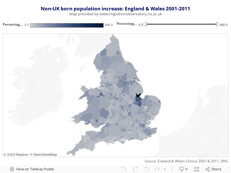
This map shows the percentage increase in the number of usual residents born outside of the UK, based on a comparison of the 2001 and 2011 Census results, in each local area of England and Wales.
Lighter shades of blue denote areas with lower percentage increases in the number of non-UK born residents, whereas the darker shades highlight local authorities with higher percentage increases between 2001 and 2011.
Hovering over or clicking on a local area will show the exact percentage and numerical increase, as well as the number of non-UK born residents in 2001 and 2011. It is important to bear in mind that some of the areas that experienced high percentage increases still have relatively low numbers on non-UK born residents.
The map can also be zoomed in by using the menu in the top left corner, and filtered by the slider in the top right corner in order to only show areas within a certain range of percentage increase.
Shows the percentage increase in the number of usual residents born outside of the UK in local areas of England and Wales.